
Everyone's making lists, but music is so subjective and I'm so indecisive that putting albums in order is just too annoying to cope with.
But i like passing judgement on things, so I'm going to give them marks out of ten for their album covers. I'm interpreting 'year' very loosely, because a year ago this blog didn't exist, and a few albums from the last year and a half I just need to get out my system. Please don't comment me to point out that one of the albums here came out at the end of last year, because that would be very dull.
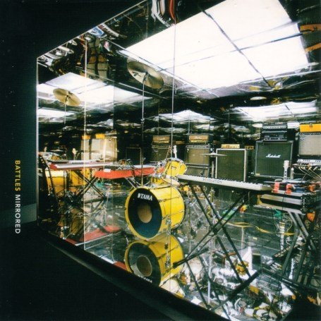
Battles - Mirrored
I have a confession to make. For some reason I decided I didn't like Battles early on this year, and whenever there was any conflicting evidence that might make me arrive at the conclusion that, in fact, Battles are good, I put my fingers in my ears and shouted 'NA NA NA I CAN'T HEAR YOU' and span round the room in circles. But then about a week ago it was quite late, and I was being driven home in the car, when Battles' seven-minute epic 'Atlas' came on the stereo and I was hooked. Due to the joys of being expected to provide every member of your family with some sort of 'gift', I still haven't got round to buying the album, but I have £10 of the money I am assuming I will recieve from some nice relatives for just that. And the cover's pretty nice too. 8/10
Buy

To My Boy - Messages
I think this is quite a nice cover overall, the way it's very clearly had very little alteration with computers, and the colours are nice. 7/10
Buy

CSS - Cansei De Ser Sexy
I HATE THIS COVER. It's very boring and the colours are horrible and it doesn't really reflect the message of CSS's music. The typography is kind cool, but this whole cover really should have been a lot brighter. 2/10
Buy

The Wombats - A Guide To Love, Loss And Desperation
This isn't really anything at all interesting or grounbreaking, but neither is the Wombats' music, so this kind of fits. The music and the cover are both nice. The cover is nice but boring, and the music is nice and fun. 5/10
Buy

Cold War Kids - Robbers And Cowards
This one is reaaaaally good. The peeling posters and monochromatic colours give it that sense of Americana and small-town decay. The album itself doesn't really do a lot to back this up - reallistically there are only four good songs on it, but the cover is great. 8/10
Buy

The Knife - Silent Shout
They really could have done something a lot more interesting. I hate these minimal covers, I really do. 3/10
Buy
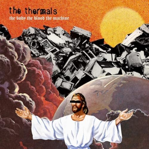
The Thermals - The Body, The Blood, The Machine
Blah Blah Blah politics blah blah blah religion blah Jesus blah blah blah America. There are some killer tunes though. 5/10
Buy

Les Savy Fav - Let's Stay Friends
I know Les Savy Fav are a rather monumental rock band, but this cover really does nothing for me. And it seems to be coloured in using felt tip pens. 2/10
Buy

Bloc Party - A Weekend In The City
I suppose I kinda like this, the whole 'modern life is depressing, look at how boring your life is' message, but could they not just have shoved a studio photo of the band on the cover? 6/10
Buy

LCD Soundsystem - Sound Of Silver
What was this supposed to be? It's some kind of giant hairdryer wrapped in foil, and the text seems to be trying to say the band's called LCDSoundsy Stem. I really like creative line run-off in the middle of words, like this for example, but in order for it to look good the letters need to be in places where they would actually have to run onto the next line, (like for example the edge of the record sleeve, not just random taps of the enter key halfway through words!) 1/10
Buy

Simian Mobile Disco - Attack Decay Sustain Release
Simple and cool. I love it. (My decision is not based on the fact that it might be possible for me to argue that they must have 'copied' having a load of grass from this blog.) 8/10
Buy

Patrick Wolf - The Magic Position
You have to admire this man for just doing exactly what comes into his head and rolling with it. I managed to see about three songs of a Patrick Wolf live show this summer, and he was great. The lighting and the colours in this photograph are perfect, and the weird 'circus' theme is really creative. 8/10
Buy
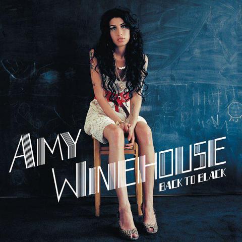
Amy Winehouse - Back To Black
This is a cover that's roughly what everyone wanted and expected. The lettering's very old-school 'jazz club' and suits the music. However, this crazy crazy heartbroken addict CANCELLED HER TOUR AND RUINED MY LIFE so she is not going to get any points at all. 0/10
Buy - except don't, you'll only be funding her life of excess!

Gossip - Standing In The Way Of Control
OK, I kind of almost get the logic behing Beth Ditto not wanting to shave her armpits, so fair play to her. But did they have to put them on the front of the album where everyone would see them? 6/10
Buy

Bjork - Volta
The bold colour, the subtle diagonal lines in the background, the strange monster suit.... this woman is mentally ill but we love her. 9/10
Buy

Kate Nash - Made Of Bricks
VERY DISAPPOINTING. I spent most of april/may/june listening to Kate Nash's music and getting all excited about how cool she was, but this cover is sooo boring. She's a singer, not a builder. 4/10
Buy

Justice - †
It's very minimal but you can see they were trying to make one bold statement with just having the one massive crucifix. If they're going to just call the album '†', then it kind of makes sense to have such a minimal cover - at least it's consistent. 7/10
Buy

Klaxons - Myths Of The Near Future
This is great because there's so much to see. Like I only just noticed that the strange fan shape in the bottom right is a photo of leaded church windows. The whole cut-and paste ethic here is really cool - does anybody know if I'm completely wrong in having this faint idea that the band made this themselves? 8/10
Buy
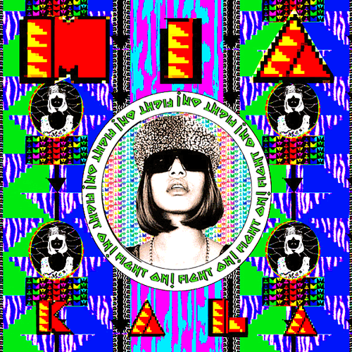
M.I.A. - Kala
Best album cover of the year. (This is taken from my list of good albums, not just any old rubbish album with a good cover.) The huge brightly coloured pixels make it look like a test card, then in the middle there's MIA in that big crazy hat looking like some kind of military leader. The 'Fight On!' typography references the bollywood influences and the sepia tones on the central photo makes the cover look really low-tech and third world-ey. 10/10
Buy
Not on this list:
Burial. I didn't get it. It was really boring. You may as well just listen to the noise of a busy street.
Panda Bear. I didn't get it. I'm not going to re-download the three tracks I downloaded off other blogs and subsequently deleted so that I can explain in depth why I didn't get it, but it just seemed really really boring.
Jack Penate. Sooooo bored of it like four songs in.
***/// UPDATE:
I cannot believe how bad I am at writing lists - I completely forgot to mention Digitalism, Bat For Lashes, Dizzee Rascal, Arctic Monkeys, Enter Shikari. Ah well, I can't be bothered.
***/// UPDATE:
I also forgot to mention how much I hate Scouting For Girls, The Hoosiers, The Pigeon Detectives and of course The View.


1 comment:
your list is very clever... i think i ve kind of similar taste in covers... for me,.from your picks, the cold war kids RaC cover is the best..
Post a Comment